Remember Google’s classic red, blue, green, and yellow? It looks like they might be making a comeback, possibly appearing soon within the Google Gemini AI interface. An early look inside a recent beta version of the Google app suggests Google is testing adding these signature colors to Gemini’s overlay, replacing its current muted look.
Contents
This potential visual refresh aims to make Gemini feel more integrated with the core Google brand, offering a splash of familiar color to the AI experience.
Peeking Inside the Beta App
Tech enthusiasts often “teardown” beta versions of apps – essentially looking at the code and hidden features before they are officially released to the public. This process gives us hints about what companies like Google might be planning next. In the latest beta of the Google app (version 16.23.69.sa.arm64), visuals and code elements were discovered that point towards a potential new design for the Gemini overlay interface.
A More Colorful Gemini Interface
Currently, when you activate the Gemini overlay on your Android phone, perhaps using the “Ask about screen” feature to get AI help with what’s on your display, the interface uses softer, two-tone colors that subtly match the standard Gemini logo. The findings in the beta suggest this appearance could be getting a significant visual update.
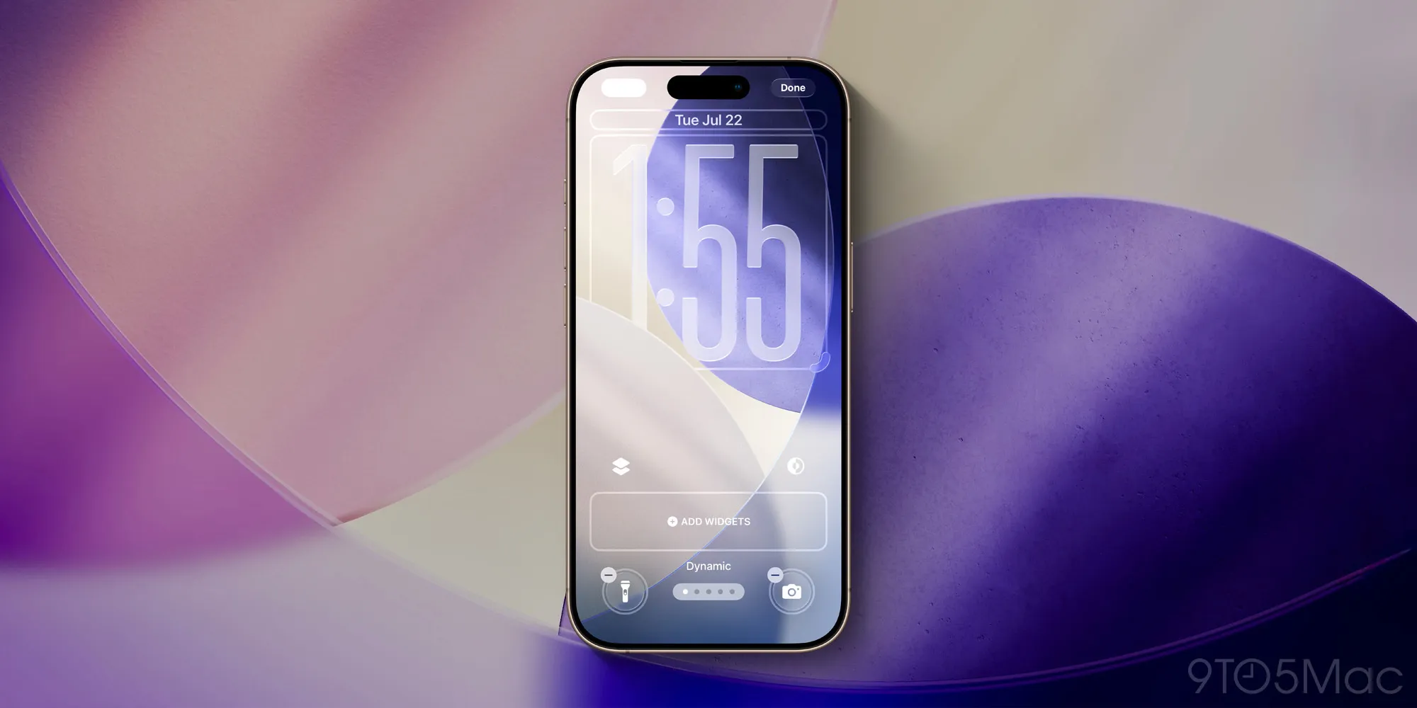
 Google Gemini interface showing red, blue, green, and yellow color accents around the microphone button and chat box
The potential new look swaps these muted tones for a vibrant splash of Google’s well-known red, blue, green, and yellow. These colors appear to be used to frame the microphone button that listens for your voice commands and highlight the chat input area where you type your questions to Gemini. It’s a notable visual shift from the AI’s current subdued appearance to something much more… well, unmistakably Googley.
Why the Change? Bringing Gemini Closer to Google
This isn’t just a random design tweak for the sake of change. It aligns with a broader ongoing effort by Google to create a more consistent look and feel across all its products and services, from Search and Gmail to its AI initiatives like Gemini. By incorporating the familiar Google brand colors directly into Gemini’s interface, the company reinforces that this powerful AI tool is indeed a core part of the Google family.
It serves as a clear visual reminder that you’re interacting with Google AI, not just any generic chatbot or third-party service. This kind of branding consolidation helps users feel more connected to the tools they use daily and builds stronger recognition for Google’s AI offerings. If you’re curious about Google’s AI advancements, you can learn more about Google Gemini and its features.
Still Early Days
It’s crucial to remember that these findings come from an APK teardown of a beta app. Features discovered in beta code are experimental and don’t always make it into the final public version that rolls out to everyone. Google might be testing this new colorful look internally and could still decide not to launch it, or they might refine it further before a potential release.
However, the presence of these elements strongly suggests that Google is at least exploring the idea of a more vibrant and clearly branded future for the Gemini interface on Android devices.
In summary, a potential visual update uncovered in the Google app beta hints at a more colorful future for the Google Gemini overlay, bringing Google’s classic brand colors to the AI’s interface. This aligns with Google’s push for stronger brand consistency across its products. While not guaranteed to launch, this change would make Gemini feel more integrated and visually connected to the Google ecosystem. What do you think of this potential splash of color? Stay tuned to our site for the latest updates on Android and Google news.